
Saul
Friday, January 6, 2023
Part 1: Use and extension of PyDegradome
Introduction
Part of my PhD work consisted in studing a putative RNA endonuclease from Arabidopsis. To this end a library of mRNA degradation intermediates was prepared and sequenced (Degradome). Since tools for the analysis of such RNA species are mostly focused on the effect of miRNAs (/E.g./ Thody et al. 2018; Addo-Quaye, Miller, and Axtell 2009) a custom script developed for the analysis of targets of a viral endonuclease on human cells (PyDegradome Gaglia, Rycroft, and Glaunsinger 2015) was used. As described by the authors their approach focuses solely on the degradome samples without relying on other sequencing data such as conventional RNAseq however, in doing so, the analysis and interpretation of the results is somehow complicated. Additionally, the output of the script (consisting of a table of genomic coordinates with significant differences between two samples) requires further processing. An attempt to tackle these two tasks was done in my work and it is briefly described below.
PyDegradome: description
The script developed by Gaglia, Rycroft, and Glaunsinger 2015 focuses on the comparison of two samples, one having the factor thought to be involved in the production of the degradation fragments and another devoided of such factor. The former is regarded as test and the latter as control sample. Identification of regions (genomic coordinates) with a significant difference in the production of reads is done by considering the 5’ end of all the reads on a particular exon, combining them withing small windows (e.g. 4nt, user defined) and calculating a test:control ratio. The threshold of significance is calculated using the test:control ratio of reads along the exon multiplied by a user defined multiplication factor for the production of degradation fragments. Confidence levels for the identification of significant differences are also defined by the user and calculated following a bayesian approach with a prior distribution of the form:
\[f_{(x)}=\begin{cases} (a-1)\cdot b^{a-1} \cdot x^{-a} & \text{for } x>b \\ 0&\text{for } x\leq b \end{cases}\]
where parameters a and b are estimated by the script “ensuring that the probability of observing a zero read count matches the data” (PyDegradome README file Gaglia, Rycroft, and Glaunsinger 2015). An estimation of the sites with zero reads is obtained by subtracting the total number with non-zero reads from a theoretical number of total sites. By default this is set to 0.01% of the human genome size and it doesn’t seem to affect the calculation unless the number of mapped reads is small and/or there is a large difference between samples (See Degradome analysis [Part 3])
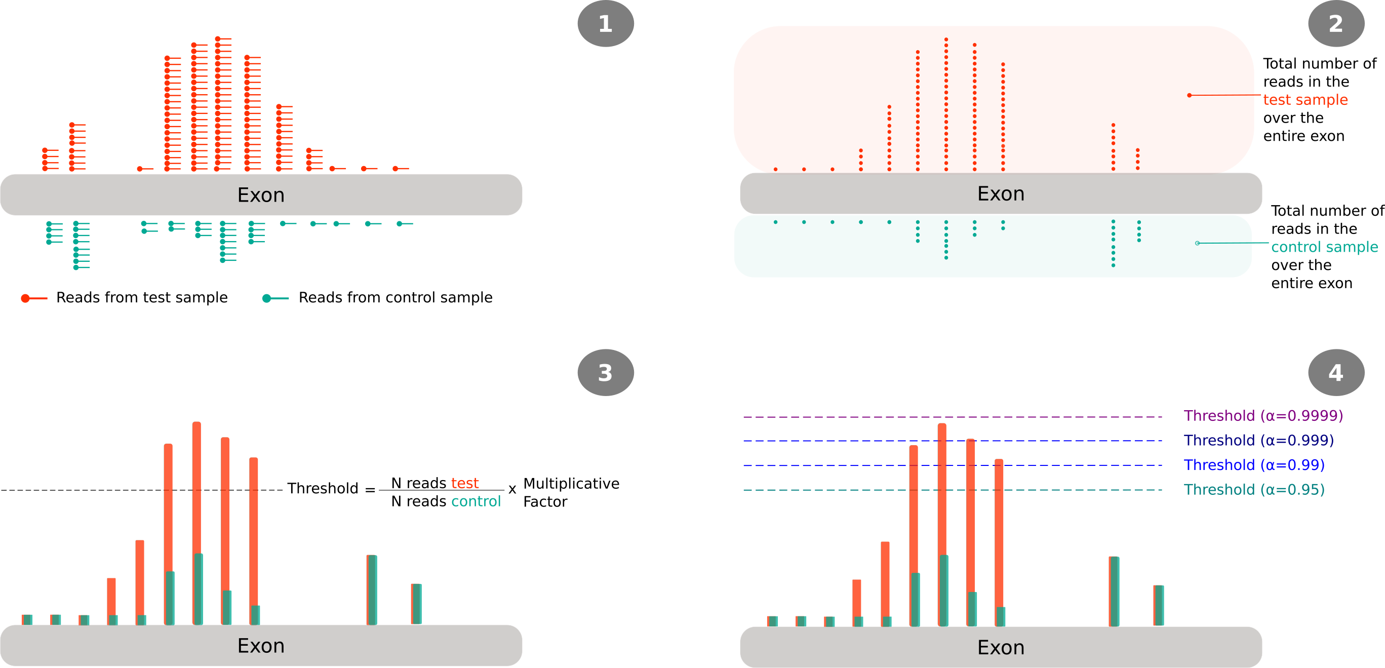
Figure 1 illustrates how reads are processed, namely, how these are reduced to the 5’ end (step 2), then the calculation of the threshold at the exon level (step 3) and how the different peaks will be considered significant or not based on the selected confidence level (step 4). It should be noted that the indicated values for the confidence level where those used in the work of Gaglia, Rycroft, and Glaunsinger 2015; and are not necessary the ones that were used in my work.
Regions were significant differences were found are reported as shown below. For each region (referred as a peak) 3 lines are reported; the first is a tab-separated entry where each value is indicated in the header (line starting with the ‘#’ character). This represents the main information about the peak and is the one that was used for further analysis. The next two are the reads found 10nt upstream and downstream of the highest point of the peak. In addition, three more files are generated as part of the output, one with the threshold values used, and two with the number of reads mapping to a particular location, one for each sample. As described in the README file, the additional files are intended for troubleshoot and thus were not considered in the downstream analysis.
Post PyDegradome analysis
As seen from the example on the code snippet 1, PyDegradome’s output needs some form of post processing. First of all, the annotation of the genomic coordinates to the corresponding gene (if available). Then, following the original work, the identification of shared peaks between replicates (See Gaglia, Rycroft, and Glaunsinger 2015 Figure 1D). And finally, a comparison of the output produced under different script’s settings (i.e. different values of the multiplicative factor (MF) and the confidence interval (CI)) in order to identify those that would result in peaks with the highest confidence (See Gaglia, Rycroft, and Glaunsinger 2015 p. 5 and Figure S2B).
In the original work, the latter point was assessed by comparing the total number of identified peaks found in test and control samples; the higher the values of the multiplicative factor and confidence interval, the larger the difference in the number of peak between samples thus, the authors chose a quite stringent settings for the identification of peaks (MF=4 and CI=0.9999). However, with the data that I was working on the opposite was observed and, as the values of the two settings were increased, the number of identified peaks was greatly reduced to only 1 candidate (data not shown).
Referring to the original work, the authors acknowledge that some of the identified peak represent a form of noise hence the need to compare the number of peaks found under both conditions or those found between replicates of a particular condition. In this context, additional ways to classify the data were tested, including the manual classification of decay plots, referred also as t-plots (German et al. 2008) or D-plots (Nagarajan et al. 2019). Figure 2 shows an example of such plot; reads corresponding to test samples are plotted on the top panel with replicates identified by different shades of red, plotted on the bottom panel are reads corresponding to the control sample with replicates identified by different shades of blue are on the bottom panel. A vertical yellow line highlights the identified peak and a gene model at the bottom of the figure helps locating the peak on a particular region.
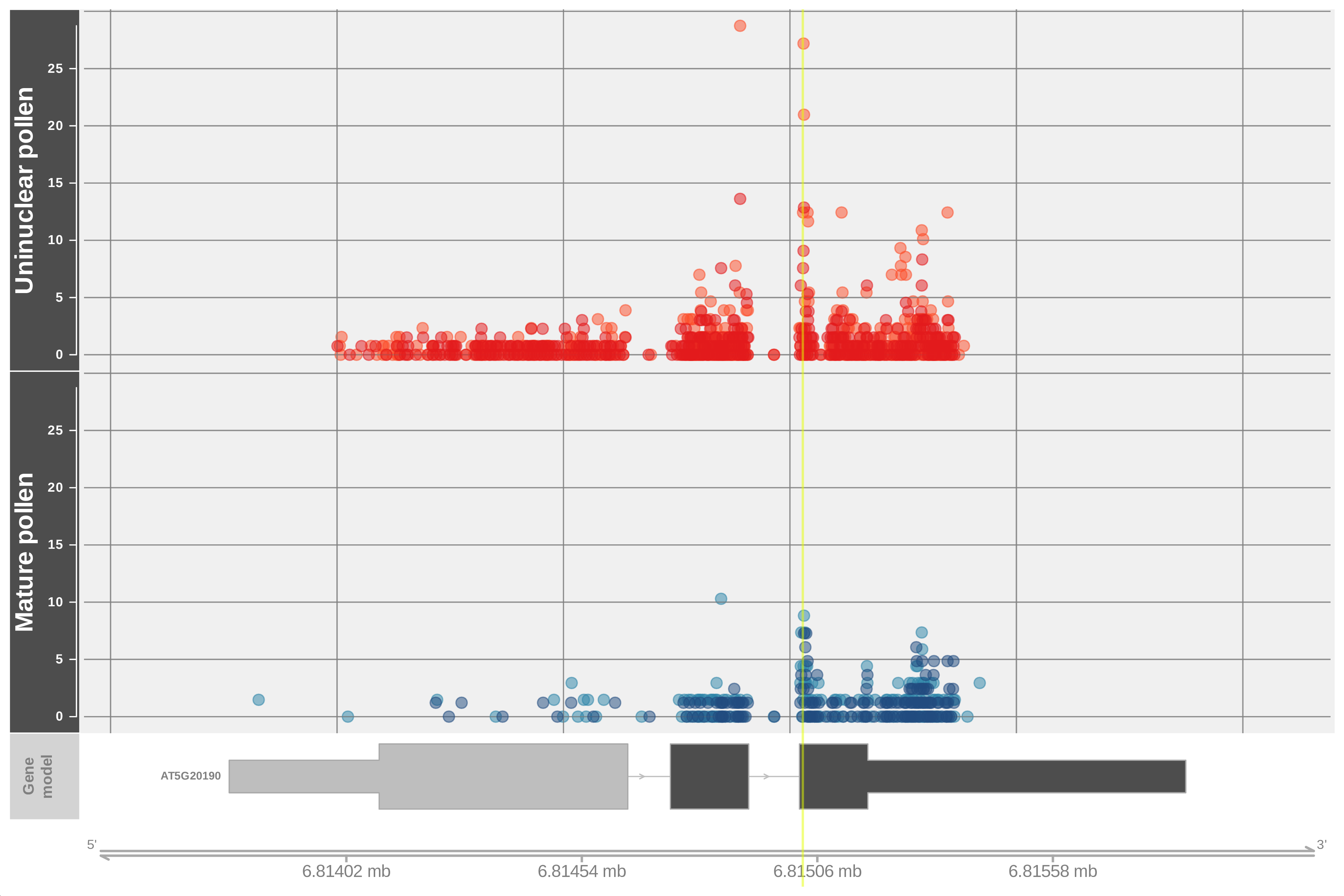
Figure 2: Example of a degradome plot (D-plot) with reads corresponding to the test sample are plotted on the top panel and those for the control sample on the bottom panel. A yellow line highlights the region identified by PyDegradome as significantly different (peak). Values were scaled using DESeq scale factor.
While conducting these observations it was noted that in a number of cases the identified peak do not correspond to the highest read along the gene region and it is even possible to find reads corresponding to the control sample with larger values than those of the test sample. Such cases arise due to the ’exon-focused’ way that PyDegradome identifies peaks, and it is not evident unless all gene reads are plotted. Figure 3 illustrates the above point, panel A aims to depict how the script identifies a region on a given exon as significantly different without considering the information on neighboring exons whereas, panel B shows a complete picture where it is evident that reads corresponding to the control sample (on exon 2) have the largest value along the gene. The horizontal black line represents the significance threshold that is calculated per-exon.
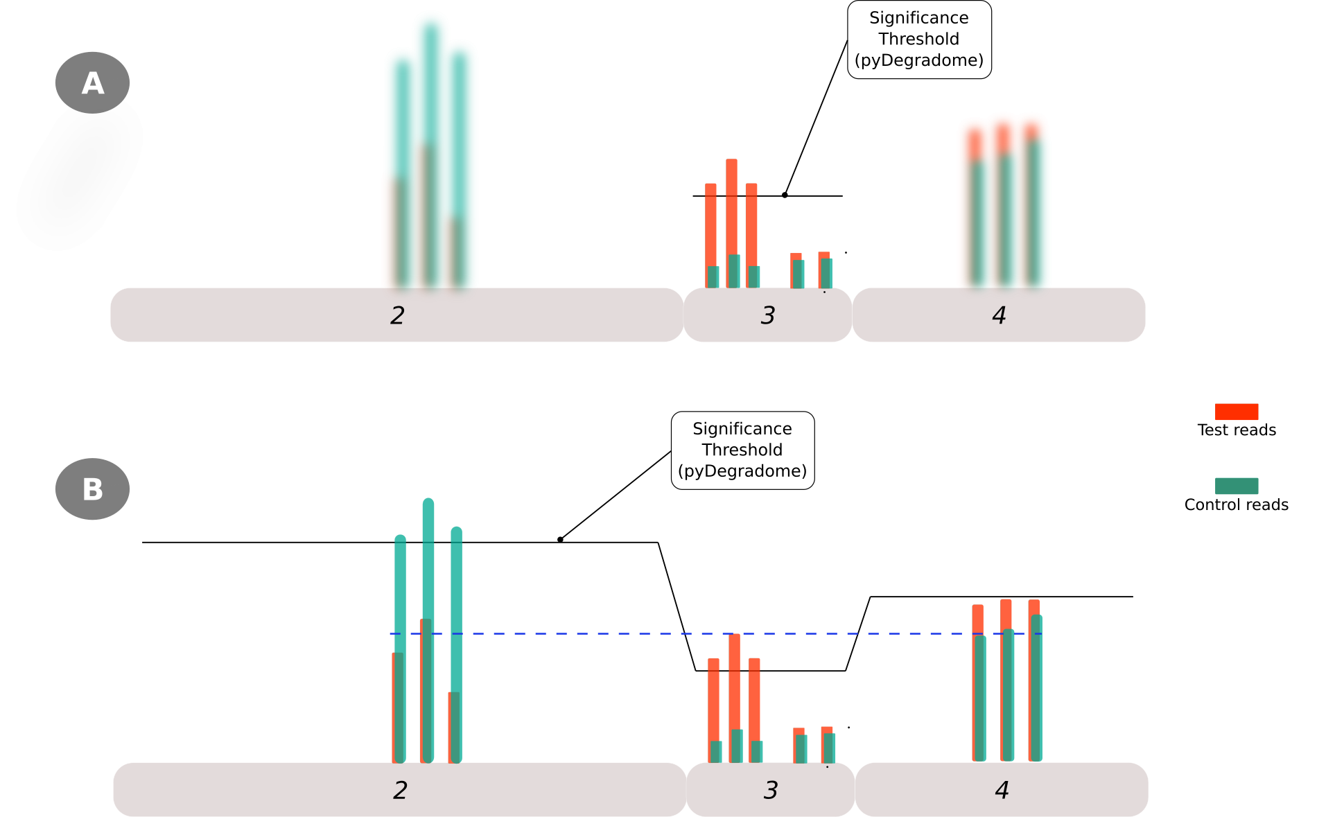
Figure 3: Limitations of PyDegradome script in identifing the region with the highest read along the gene-region. This is due to the exon-focused nature on which peaks are identied (A) and how this may ignore the information of neighboring exons where reads with larger values could be found (B)
Description of the extended analysis
To account for the above observations a filtering and classification step was included. Peaks obtained from the PyDegradome output were classified into 4 categories based on the value of the ratio between the peak (highest point) and the highest read found outside the peak region (Figure 4). Category 1 comprised peaks with a peak:background ratio higher than 1; Category 2 included peaks with a ratio between 0.8 and 1; Category 3 for peaks with a ratio between 0.7-0.8. For the first 3 categories an additional requirement was that peaks should be present in both replicates (i.e. their coordinates should overlap by at least 1nt). For Category 4 coordinates of peaks found in only one replicate were then used to calculate the number of reads in the second replicate, and those with a peak:background ratio higher than 1 in one replicate and higher than 0.8 in the other were selected. Finally, those peaks that could not be classified in one of the above categories were labeled as Category 0 and ignored for the rest of the analysis.
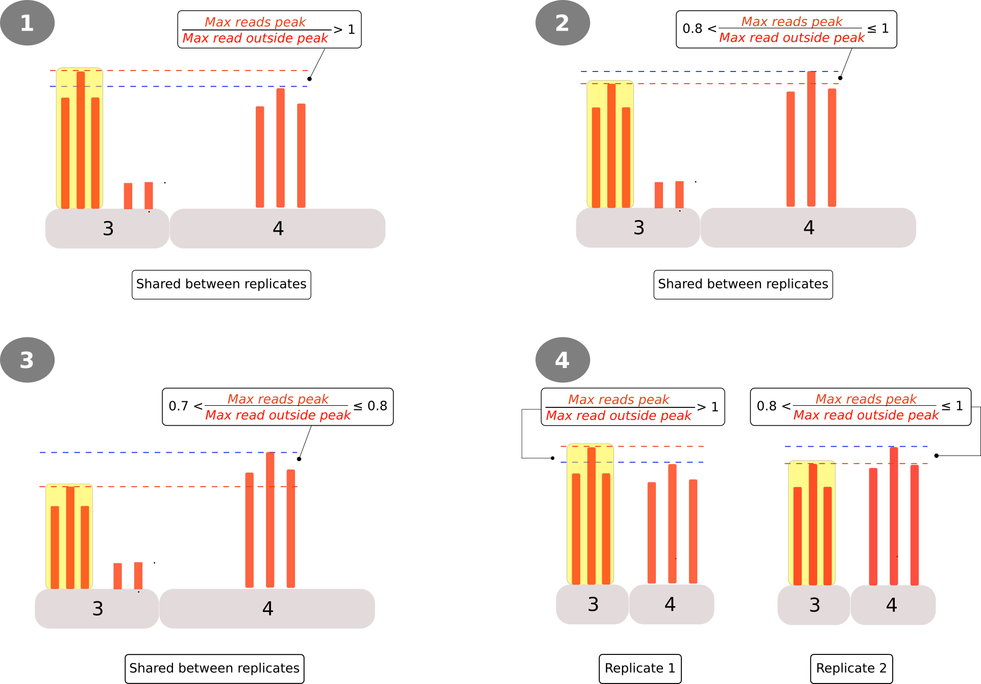
Figure 4: Criteria for the classification/filtering of peaks obtained from the PyDegradome analysis. A ratio between the peak’s reads (highlighted yellow) and those outside (background) was used to define 4 categories (Circled numbers). Categories 1 to 3 consider peaks found in both replicates while, category textcircled{4} analyzed peaks found only in one replicate. In the latter case, coordinates of the identified peak were applied on the other replicate as it were a significant ‘peak’
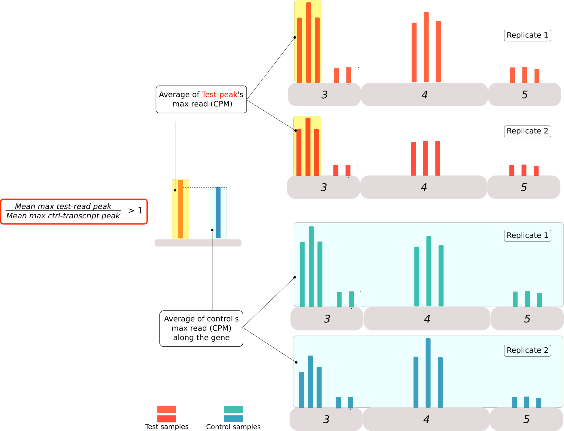
Figure 5: Criteria for the second classification of peaks obtained from the PyDegradome analysis. A ratio between the highest read in the peak region of test samples(mean of scaled values, red bars) and the highest read along the transcript from control samples (light blue bar) were used to classify the peaks into 3 categories. Category A for peaks with a ratio greater than 1. Category B was designed for those transcripts with more than 1 peak, where the ratio was higher than the median value of control samples. Finally category C included all the candidates that could not be classified in the two categories above. No candidates were removed from further analysis.
R scripts (described in another post). The output is a number of tables summarizing the classification filtering steps.Results: ‘Summary of classification / filtering process’
The first of such tables is one summarizing the number of peaks resulting from the PyDegradome analysis under a particular combination of two settings (Multiplicative factor and Confidence level) followed by the number of peaks remaining after each classification step. Finally, on the last column the number of peaks classified at the top of both classification steps (i.e. Category 1 and Category A) is reported as the group with the most promising candidates for further studies.
Results: ‘List of candidate peaks per comparison’
This represents the main output of the whole classification process since it lists all the transcripts associated with a peak, sorted by the two categories and the magnitude of the ratio between the highest point of the peak (on the test sample) and the highest read in the control sample (Peak(T):Max(C) column). Links to the associated D-plots at the gene level (Gene plot) or at the peak level (Peak plot) are provided for visual confirmation. Additionally, links to the Parallel Analysis of RNA Ends database of Donald Danforth Plant Science Center, as well as, to the Arabidopsis Information Resource (TAIR) associated pages for each transcript are also provided. The former could be used as a form of control for the observed mapped reads whereas, the latter was intended to facilitate the access to additional information on a candidate of interest.
Final thoughts
- The script
PyDegradomewas written for a specific purpose, the identification of potential targets of a viral endonuclease with a broad range of targets. The use of control samples lacking this endonuclease (i.e. uninfected) would in principle result in large differences in the number of degradation intermediates, which in turn, would support the use of stringent settings for the identification of candidate targets. - A somehow similar scenario could be expected from data sets resulting from the over expression of miRNA although it is more difficult to predict the results on the accumulation of degradation intermediates due to the need of other factors for their action (/e.g./the endonucleases Dicer in animals and Dicer Like 1 in plants). On the other hand, data sets from mutant studies (or from the comparison between the same genotypes under two different conditions) are less likely to result in large differences in the accumulation of degradation intermediates and/or the direction of such differences are difficult to predict.
- It was in the above context that the additional classification/filtering steps were implemented. The results of my work (not shown) were similar to those obtained using publicly available data (Oliver et al. 2022 as shown above) in the sense that the number of candidates was greatly reduced after each of the classification steps to a list of less than 100 candidates at the top classification (Category 1 and Category A). Visual inspection of the decay plots of these candidates seems to support the classification.
- On a following post the implementation of the code will be described
References
Data set
- The code snippet (
), example of decay plot (
), summary data (
) and the list of candidates (
) are all from the analysis of Oliver et al. 2022 data.
- files: SRR10759112 SRR10759113, SRR10759114 and SRR10759115 mapped to Chromosome 5.
- PyDegradome settings:
MF=4andCI=0.95
Web resources
- Post cover image:
- Artist: RF._.studio
- License: